Friday 20 December 2013

Season's Greetings


I would like to wish you all a very Happy Christmas and a prosperous and peaceful New Year.


For those of you who are interested, the card this year was painted by cutting a small square stamp with the branches of a conifer scored into it. The stamp was made of ordinary mount board, and I used the same stamp throughout. I painted the stamp with a mixture of Apatite Green and Paynes Grey and then pressed it onto the dry paper in several positions.
I then lightly dampened the top edges of some of the trees, and added trunks and shadowing in the snow.
I gave the whole painting a good splatter of white acrylic gouache to represent the falling snow and then scanned it into my pc, added the lettering and border and simply printed the required number.
See you all in the new year....have fun!

Thursday 19 December 2013

Peonies

This will probably be my last big painting before turning the studio into the guest bedroom. It is called peonies, but I am not sure that the image is botanically correct or if peonies exist in this lovely colour, but I don't really think it matters. I just had the urge to use this lovely Quinachridone Coral which has been tempting me for ages. I took the shapes from a variety of gardening books of which I have many!

The process was quite simple.....a decent drawing, painting the flowers and then adding a background wash and over painting the leaves.


Sorry about the photo. I am not sure why the drawing is so faint. I took the photo in the usual way but can only assume that the poor light we have had recently is to blame. I also have no idea why the second image has acquired a blue background. It is definitely white!


The flowers were painted using only the Quinachridone Coral in various strengths and a little Indian Yellow to add vartiety.


I used Moonglow with a little of the coral for the dark centres. It made a lovely colour, but even at this stage I was a little worried about the centre of the LH flower. I then removed the pencil lines from the flowers, leaving only those that defined the outer edges. These will be removed after the background wash has dried.


I added a wash to the background using Apatite Green Genuine mixed with the coral and a little Indian yellow. These colours were just dropped onto wet paper and allowed to blend naturally.

I over painted the wash with more Apatite and Hookers greens to produce the leaf shapes, and finished off the markings in the centre of the flowers. Finally I darkened a bit of the background in the centre of the painting.


'Coral Beauties'
Watercolour on Fabriano Artistico Extra White Not
45 cm x 30 cm


I did wash away a bit of the colour in the LH flower centre, which I think helps, and I am particularly pleased with the way some of the leaves have picked up the background colours.

Thursday 12 December 2013

Christmas cards

This week at Avon Valley Artists Group it was time for those who wanted to, to prepare for christmas. I always try to prepare my daughter's christmas card during this session, but I have to admit that I am beginning to run out of ideas. She, unfortunately for me, keeps them all, or I might be tempted to look up the old records and adapt some of those from earlier times. I think I paint a little better now.
However, the task had to be faced and putting up the christmas decorations this week, I thought I might try to replicate the garland that hangs above the mantle piece.

I began by measuring out a piece of paper the size of my card envelopes, doubled its width and folded it in half, to ensure the painting went on the correct half. I could do just a simple painting and then mount it on card, but I thought it might end up a bit heavy.

I started by applying a green and yellowish wash to the paper to sort of suit the holly, ivy and greenery I intended to use.
Using a pair of compasses, I drew a circle very faintly in the middle of the painted paper.

I then began filling in the circle with holly,ivy and evergreen sprigs.


When the circle was complete, I painted two scraps of paper with some green and greenish-yellow paint to use as extra leaves to be applied 3D to the card.


I drew simple holly leaves on the dark green, and ivy leaves on the paler section and carefully cut around them. I then glued these leaves at random around the circle and added red circles cut using a hole punch from red painted paper. I lightly sprayed it with white acrylic gouache on a tooth brush to create very fine spatter, and added a highlight to the red circles.

I then printed a Season's Greetings label to stick on the bottom.


The label does not look quite straight, but in fact, it is. The water colour paper has buckled slightly and the label stands proud of the painting, so it looks odd in the photo. I only wish I had used a capital G on the label!

Because of the 3D nature of the card, I then had to create a box into which to put it. It was worth the trouble because I am sure she liked it when she opened it. One more job I can now tick off of the list!!

Saturday 7 December 2013

Scabious


After having spent quite a lot of time on tight precise images.....the butterflies and my daughter's Christmas card (which I will show you in a later post)........ I had the urge to paint something bold and free. I have a bunch of artificial flowers in the conservatory which it has never occurred to me before to use as subject matter. I love the very dark blue in some of the flowers and decided they were worth a go. Sorry....the photo does not do them justice!


The point of this exercise was to loosen up, so I decided that there would be no drawing at all in this painting.Nor was I concerned about producing a recognisable type of flower.


I simply wet the paper and dropped colour onto the sheet where I thought the flowers might be, adding greens below to suggest the stems and leaf positions


Without any drawing I began to do the flowers, working around the central area of each, which I had blotted out with a bit of tissue, whilst the wash was still damp.


I am a little disappointed with the flower on the lower right edge, but as a quick and spontaneous exercise, I am quite pleased with it. I might not have posted it except for one part of the painting which I really love and I thought you might like to know how I achieved it, if you haven't happened on it by accident already.


I really love the way the paint has travelled across the paper in little zig-zaggy lines almost as if the paint is granulating. At first I was not sure what I had done. Then I realised that I had wet the paper by spraying the surface. Hence, the paper was covered in tiny droplets of water and the paint ran through the drops but failed to cover the dry areas. What a lovely textural passage....I will definitely use that trick again.

Tuesday 3 December 2013

Butterflies

This weeks subject at Avon Valley Artists was Birds and Butterflies.
I have a book of butterfly photos and on browsing through it, came across a photo of a huge swarm of Monarch butterflies, sunning themselves on some warm rocks.

I thought it might make a lovely pattern painting.


                                          From 'Butterflies' By David Badger and Brian Kenny

I had no intention of making exact drawings of each butterfly, and was not even concerned about them being true monarchs. I just wanted to have a go at producing a fresh attractive painting where the subject was obviously butterflies, but nothing specific.
I liked the way there were lots of different shapes, plenty of white and that lovely rich orange colour. I instantly thought of using Transparent Orange and Pthalo and Cobalt Teal blues for the background.

The process was simple. I drew out the shapes using first a pencil and then a fine black liner pen. I then washed over the shapes with the Transparent Orange, leaving plenty of white. Large areas of black were painted in Indian Ink.
I used the two blues and some Quinachridone Rust for the background, and that was about all. Two points to make:
1. It took ages to do the drawings and I was quite bored with the whole thing by the time I got to the end of the pen drawing, and in places I got quite careless. It needs patience!
2. I had various pens on the table at the time, and did not realise that I had picked up a non permanent one for a small part of the drawing and so when I added the wash, the black lines bled into the wet paint.I need to be more careful!


                                                      'Butterflies' (unknown paper)

Sunday 24 November 2013

Portraits At AVA

I am writing this post in the spirit of 'warts and all'. This week at AVA we were painting portraits. Is there anything further outside my comfort zone than people or animals, especially when a likeness is required! I confess to not having a clue what I was about, but disciplined myself to look at the chosen image as just another set of shapes. Getting a likeness was not within my aspirations.....I just wanted a painting that looked reasonably like a human being.

I did have a quick look at some of the paintings in a book called 'The Figure In Watercolour: Simple, Fast And Focused' which is a lovely book for starting from, if you want to have a go at painting people.

I tried to keep the subject simple and the colours low key in the hope that any mistakes would not jump off the page, but I do apologise to Dave.. my daughters partner..for making him much less handsome that he really is!!

Thank goodness that is over for another year!

Sunday 17 November 2013

Red Tulips

I must have a subconscious desire to bring a little warmth into the house now that winter seems to be fast approaching, and so have a bit of a 'thing' going on with red!
I came across a photo taken taken by a guy called Clay Perry  in a book on tulips. He is a great flower photographer and any gardening books with his name given as the photographer always finds it way to my bookshelf! I had no intention of painting a botanical replica, but I thought it was a useful starting point.


'From 'Tulip' by  Liz Dobbs
Photo by Clay Perry

I started with a simple line drawing of 3 tulips, using the photo as a vague guide. I began the painting by using Pyroll Red and Indian Yellow and lots of water to complete the three tulips.


The stems and leaves were painted using Apatite and Sap Green, with a little Indian Yellow in places, and the markings on the leaves were created whilst the paint was still quite damp, using a twig of Forsythia which has been sharpened to a point with a pencil sharpener.
At this stage I felt the painting was a little too tight, so using plenty of water and the same colour combination, I added patches of colour which I teased into less obvious tulips. I then needed to add the appropriate stems and some additional leaves.


All that remained, was to tackle the background. I erased all the pencil lines that I could, and then using combinations of Apatite Green Genuine, Indigo and Indian Yellow, I washed in parts of the background, keeping the colours strong behind the flowers in the middle and more varied around the edges.


I kept adding washes and darkening corners until I was happy with the strength of the background.
 I finally mixed a little Pyroll Red with a tiny amount of French Ultramarine Blue, and used this mixture to darken some parts of each tulip as shadow areas. This is not too evident in the photo but looks stronger in the original painting.


'Red Tulips'
Watercolour on Fabriano Artistico Extra White
300g Not.   35 x 50cms

Thursday 14 November 2013

Poppy

This weeks AVA group subject was 'Hats, Bags, Shoes'. As we have had this subject on the programme for several seasons, I have exhausted my supply of paintable objects as a still life study, so I decided to try something new.
I liked the idea of painting a person in a hat, but was quite anxious about the face as I do so little of that subject. So I chose to paint the young lady facing away from me, holding her hat against a light breeze maybe and looking out across a landscape.
To make the painting more interesting, I added a large poppy to the hat brim and I made the fields into poppy fields. I thought these two elements nicely linked into the red nail polish.

I did quite a careful drawing as I did not want the hands to look like bunches of bananas, which is so easy to do.
I masked out the stamen area of the poppy on the hat, but that is about all the preparation I did.

I painted all the elements in a traditional watercolour manner, adding a bit of splatter to the poppy fields to hopefully help the illusion along.
At the end I also added some browns to her hair as I realised that my mixture of Anthraquinachridone Blue and Burnt Umber was a little to uniformly 'black'.

For someone who rarely paints figures, I am quite pleased with the result!


'Poppy'
Watercolour on Fabriano Artistico Extra White
300g  cold pressed paper

Friday 8 November 2013

Misty Morning

This weeks topic at Avon Valley Artists Group was 'Misty Scene,.....Everything that is possible outside my comfort zone and no time for preparation or pre-drawing, with all that is going on.

I simply picked up my bag of tricks, a block of paper and about 4 photos which had some 'mistiness' about them.
Landscapes do not naturally get me too excited so I take very few photos of my own......I am usually peering over people's front gardens. But I was glad that I keep my resource material reasonably well filed so at least I was able to lay my hands on what few I had, pretty quickly.

I decided on a very simple early morning scene looking across a still lake with very lightly defined trees in the background and a bit more detail in the foreground.

I began with a simple wash, using lots of water and letting the colours merge into horizontal bands across the paper. I tried to keep the centre very light to suggest the emerging sun and you can see where I blotted out a circle with the sun in mind although I did not use it in the end.


I allowed the paper to dry a little and attempted to catch it at that stage when there is still a sheen of dampness on the surface. At this point I added the distant trees and hedgerows, adding a little more paint if the original brushstrokes bled into the wash too much. It was very much trial and error as I do this sort of thing so rarely.

When I was satisfied, I then filled in the foreground with much stronger colours and shapes, and finally stroked diluted white acrylic gouache across the 'mistiness' where water meets land.


I suppose it worked better than I had any right to expect, and some bits like the very pale central horizon and bits of the foreground are ok, but it it too 'chocolate box' for my taste and I think the RH and LH foregrounds are too far apart. I have tried adding a boat and wading birds, but didn't like what I pencilled in, so erased them, although I am sure it needs some point of interest on the water.

A case of need to try harder!!

Wednesday 6 November 2013

Patty's Plum Poppies

Life has not been easy, with regards to family, of late. I felt a real need to immerse myself into a painting to try to get back my equilibrium. It has been such a joy to be able to forget for a little while all that is happening in my real world at the moment.


Looking for something really lovely to paint, well within my comfort zone, I found this photo of a beautiful clump of Patty's Plum poppies. They were just what I was looking for.


I decided to do the drawing first, as I needed to know where I was going to put the two separate washes. It is not something I like doing as the pencil lines cannot be totally removed once they are covered with paint.


Once the drawing was complete, I put on the top flower wash using Quinachridone Magenta and Anthraquinone Blue. I also added some Opera Pink to lighten the mixture. I let this dry completely before adding the green/blue wash so that the two sets of colours did not run into each other to give that slightly muddy colour you can get when mixing greens and pinks or reds together.


Working from the top, I painted in the flowers using the same colour range as the background wash, adding leaves and stems as I went along to make sure they would read correctly in the finished painting. I also tried to produce some lost edges in the top LH corner.


At this stage I began to be a bit concerned about the arrangement of the poppies as I could see that the RH one was going to be at the same height as the other two lower flowers. There was nothing I could do about it as the pencil lines could not be completely removed (a reason to do the washes first!) so I just had to go along with it and hope it worked ok.


I completed the flowers, and being careful not to hide too much of the original lower wash, which I really liked, I painted in the leaves using the same palette as the underlying wash. A few veins on the poppy petals and the lightest of splatters and I think it is finished.
Maybe the composition is a little top heavy, but I think I like it like that and for once I can honestly say that I am very pleased with the result.

Saturday 2 November 2013

Autumn Still Life/In the Kitchen.

I have had such a hectic three weeks, both family crisis, and house decorating, that I have not even had chance to finish the last two weeks studies done at Avon Valley Artists. Last night I finally found a couple of hours to myself, so instead of starting something new, I got out the two paintings and made a push to get them finished. I am pleased that I made the effort as I quite like both of them, although they are totally different. I share them here with you, without the usual step-by-step comments, just so that you know that I am still painting, although the blog has been quiet for a little while. I hope you enjoy looking.

Two weeks ago the subject was Autumn Still Life, and this piece is painted on the usual rough Fabriano Artistico paper.


Last week, the title was 'In The Kitchen' and I chose to paint from a photograph given to me by a 16 year old student of Photography, produced for her final Photographic Display.


Hopefully,things will get quieter, and I will find more time to spend in the studio.

Saturday 19 October 2013

Glass Exercise

At Avon Valley Art Group this week, the subject was 'Glass'. I thought about what I could attempt, knowing that the 'glass' part of the painting would be quite demanding, but wanting to make as good a finished painting as possible.
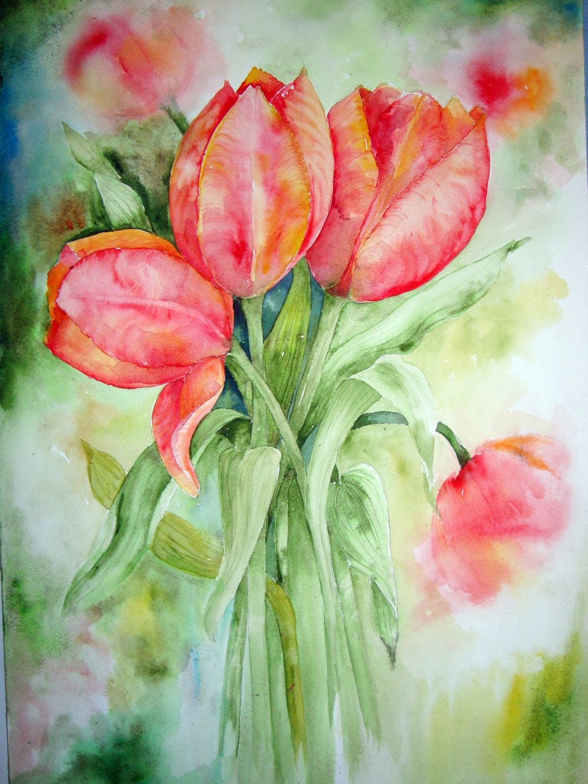
I borrowed a couple of glass bottles from a friend and looked out a glass bowl from among my many props and decided to add a large flower head to the painting. I think, sub-consciously, I hoped this might detract from any deficiencies in the painting of the glass.

I have been very busy this week doing painting of a different kind in our lounge, but I made sure that I found the time to do as reasonable a drawing as possible.


I wanted to be able to add the background wash reasonably easily, so I blocked out the Agapanthus flowers with Pebeo Drawing Gum, using a 'Shaper Maker' instead of a brush. This was quicker and gave more even shapes. I also used the gum to retain the highlights on the glass, although I knew that when I got to the group the following morning, the light would be completely different.
I was also anxious to complete enough of the painting, to enable me to remove the gum asap as I did not want it to spoil the surface of the paper.


I painted in the background wash, making sure that there were shades of blue behind the LH bottle, which I then added, making sure that some of the colour was visible behind the central shape.


Next, it was time to add the stem and leaves inside the bottle in the foreground, and when they were dry, I painted in the pale glass, and tried to give an impression of water. I had spent some time in the studio, the previous evening, working out what these elements would look like, by placing a random twig with leaves from the garden, in a jar of water!( I was painting the flowers from memory)
I also began to add detail to the RH bowl. I then began to remove the gum a little at a time, to paint in the flowers. I did this gradually, as in removing the gum, the pencil drawing is also removed. I wanted to try to remember which flowers and stems were forwards or backwards in the composition, and by doing it a bit at a time, I was able to do this.


I finally added a bit more strength to the background, trying to get it to show through the glass without darkening it too much. The final painting seems a bit lacking in my usual contrasts of light and dark, but its ok.
At our 'end-of-session' viewing of the group's work we all agreed that painting glass objects successfully, is a difficult task, as there are so many elements to bring together, but members seem to enjoy being set a challenge, so I am sure it will appear on the programme again.

Monday 14 October 2013

Trees : experimental

This week at AVA we had a chance to experiment instead of subject-specific painting! The brief was to produce an image in a wet medium without using any of the traditional tools to apply the paint. A brush could be used to mix the paints and a pencil could be used for an initial drawing if required. After that it was a case of looking around to find ways of putting paint on paper. This could include finger painting, sponges, dropper washing, twigs, paper or printing with odd shaped objects.

It seems that the members must have liked the idea as there was a good turn out, and some interesting work was produced.

I opted to paint a simple landscape without any preliminary drawing, and as it was going to be a hit or miss affair, I chose to use up some paper that I would not mind spoiling or abandoning. I used a piece of Hahnemuhle 'Cornwall' 450g paper. this paper is very white and has a very distinct hessian-like grid to it.

I did regret the paper to start with as it was very poor at taking the initial washes and it was at this point that I regretted most the lack of a big brush!

Not to be daunted, I mixed up some indigo wash which I dropped into the LH bottom corner using a plastic dropper, and blew the resultant puddle across the paper using a straw. This created a reasonable series of twig like shapes across the page, which instantly suggested a row of trees.
The rest of the painting was produced by adding pigment using a stick of Forsythia which had been sharpened in a large pencil sharpener, and a piece of diagonally trimmed bamboo. Areas of paint which needed a more wash-like finish were added with a cotton bud dipped in paint.


I am really pleased with the effects created in the painting, helped by the texture of the paper. I wish I had made the grasses to the right of the path less turquoise by adding magenta to the mix to pick up the same colours as the LH tree, but apart from that, as a brushless painting, I think it works ok. And as usual, doing this sort of experimental work is great fun!


Wednesday 9 October 2013

Teasels

Making the most of what is around at the moment, I have had another go at a bunch of teasels. I love their curly dried sepals (?) and their spikes.

I only had a couple, but they are quite standard in shape so I used my imagination to compose the group. I did have a photo of the original drawing, but transferring the photos from the camera card to Photoshop, it got deleted, so sorry about that.

Once the drawing was complete, I used masking fluid to protect the spikes and the sepals, as I wanted to be fairly free with the initial wash. I really do prefer Pebeo's Drawing Gum to all of the others. It is the most free-flowing of the rest that I have tried, and works well in my drawing pen, which I use for applying very fine lines like stamens and spikes. It is also good in that it has a light blue colour, so you can see where you have put it. I also masked out the stems at this point. It is a good idea to test the masking fluid on the paper before committing it to the actual painting. If the masking fluid is to stay in place for any time,  I have found that the gum can remove the surface of the paper. This seems to happen especially with light weight or cheap papers.


 When the gum was completely dry, I washed the whole of the background with Transparent Orange   (Schminke), Cobalt Teal Blue ( Daniel Smith ) and Indigo ( Daniel; Smith). I was careful not to paint inside the teasel shapes. I then added sea salt into parts of the background, to be used to create some more hedgerow type stuff behind the teasels.

The painting had to be left over night to allow the salt to dry thoroughly, hence the need to test the gum. The larger pieces of sea salt take a surprising amount of time to dry, and because they absorb quite large quantities of paint, some quite pale areas can appear around the salt, with some quite dark areas where the salt has been sat.

When all was dry, I brushed away the salt and removed the gum. Using mainly Yellow Ochre, Quinachridone Rust (Both by Graham ) and Burnt Umber ( Daniel Smith ) I painted in the teasels.


I used white Acrylic Ink and Acrylic Gouache to add form to the seed heads in the background and to highlight some of the spikes. I also added a little bit of form to the base of the teasels from where each spike grows.


All that was left to do was to add a few darks to the stems and the base of each seed head and a gentle spatter of Cobalt Teal Blue and White Acrylic Gouache, and it seems finished.
As usual, I will live with it for a while before mounting, in case anything seems to need adjusting.

                                                                             
                                                                           'Teasels'
                                      Watercolour on Fabriano Artistico Extra White 300g Rough

Monday 7 October 2013

Last of the Apricot Roses

The garden is responding to the lovely weather we have had over the past few days, and the last of the roses have opened and are beautiful. I thought I would take advantage of them and continue to address the problem of shadows, which I still feel I have not really got right yet.

I drew out a relatively simple drawing of three of the roses, adjusting their positions, as I did not want to bring them indoors, so did the drawing from the studio window.
I painted the petals of all three roses first using almost nothing other than Transluscent Orange with the occassional addition of Cobalt Teal Blue. At this stage, progress seemed ok and the composition and accuracy of the flower heads was fine. I had remembered to avoid painting over the pencil line so that I could remove them at this stage.

I then started to paint in the dark areas of the background using mainly mixtures of Indigo, Quinachridone Rust and Apatite Green. I kept it really dark in the top LH corner, add gradually added more water as I came around the LH edge. I painted the RH side with transluscent Orange to try to get the lost edges I wanted from the RH rose.


This photo may not look too bad, but the original painting, at this point, looks pale, insipid and in all honesty, a bit flat.I wanted the flowers to have more of the 'umph' they would have in the sunshine. I know this is achieved by the strong contrast between the lights and darks. I can see that there are still plenty of lights but it is sadly lacking in the strong darks.
Working on the premise that the cast shadows are just a darker version of the petal colour, I mixed some strong Transluscent Orange with a little Quinachridone Rust and with trepidation added it to various parts of the painting on the LH side of each flower.
Now I think the shadows have become quite muddy and  I would love them to look fresher and less overworked, so I will need to keep trying with other combinations to see what I can produce.

See what you think.


                               Usual Fabriano Artistico paper, with mainly Daniel Smith paints

Thursday 3 October 2013

Seed Heads

This weeks title at AVA was seed heads. We had a lovely variety of subjects among the group and I have a pot full of dried seed heads in the studio from which I  prepared a drawing and initial wash of some Chinese Lanterns and some dried Honesty.


In my pursuit of a bit more of a loose approach to my painting, I tried not to spend too much time on each element, just trying to keep the paint relatively fresh and to just make a painting sketch of the group.


By this time I was really pleased with the colour and shape of the Chinese Lanterns, but struggled much more with the twigs of Honesty..I did think of leaving it at this point and looking on it as a simple unfinished exercise, but I felt there were still too many unfinished shapes to justify this. I kept going in the hope that something reasonable would emerge at the end of the session.


I used a sepia, non-permanent fine liner to give a bit of definition to the shapes, and then washed clear water over the pen to cause it to bleed a little.....this makes it less of a harsh line.
I think maybe that all the honesty pods are a little too evenly painted, so I may paint out some lost edges, maybe using white acrylic onto a wet surface, but I will live with it for a few days before deciding if it is worth the effort. I also added a little Cobalt Teal Blue to the LH background on the advice of Peter, and I think he was right to suggest it, as the Teal Blue and Transluscent Orange go really well together.

As a postscript, I think I do find the mid painting more attractive!


Friday 27 September 2013

Apples

I am trying to make the most of all this lovely fruit that I am being given, so I had a go at a bunch of apples. I can't really say that I enjoyed the repetitive nature of the foliage, but I supposed it was necessary, and I did enjoy trying to paint the apples!


Again....maybe they needed more darks in the shadows, but as I do not intend to do anything with the painting, it probably will not get altered.
And just to prove that I occasionally try my hand at something different, the subject this week at AVA was 'Tigers.'
Totally outside my comfort zone, but as there was no choice, it had to be done!


I am sure a selection of the paintings from the rest of the group will appear on Peter Ward's blog if you are interested in looking  (http://watercolourfanatic.co.uk)